Friday 24 February 2017
Animation
Sunday 19 February 2017
Catch Me If You Can Analysis
Catch Me If You Can
The title sequence shows the audience a different kind of sequence. The sequence gives the audience a small insight to the films plot as well as leaving hints for the audience to guess for what will happen in the film.
We are introduced to a mysterious diegetic sound, this reflect to the genre of the film. An animated man carries the mysterious genre through out the sequence. The animated man connotes that he is the main character of the film who seems to be trying to hide himself as he tries to keep himself away from another character. This is related to the title of the film "Catch Me If You Can". As well as this, it may keep the audience curious as they would want to know what he's running from. The opening shots of the title shows the distribution companies that were behind the production of the film. In this case, DreamWorks Pictures. The next scene shows us the director of the film, Steven Spielberg.
Catch Me If You Can is different to other opening sequences mainly because of the typography and how its a animated sequence. A reason as to why this is good is because it's an example of how a film producer can convey a message about the actors as well as establishing the setting in the beginning part of the film. The typography of the sequence matches the images on the screen. For example when the title of Leonardo Decaprio came we saw the image of his character.

The fact that the film is based on a true story makes the audience look at the movie in a much different way as its based on real life events which makes the movie a lot more exciting. The opening sequence also does a good job in establishing the setting of the film. In this case, America. This is backed up by the urban buildings and the yellow taxi's. Looking at how the character in the sequence keeps on changing clothes we can gather that the theme of the movie is identity. Also, the sound that is used is Jazz music which connotes that the film is set in the 40's or 50's.
Tuesday 7 February 2017
Genre Title Sequence
I really struggled finding a title sequence within my genre as most of the sports opening sequences consist of a starting prologue or a scene from the movie which the movie is about. The sequence i will be analysing is a good example of a opening as it explains to the audience clearly what will happen and sets the plot for the movie.
Goal 2 Title sequence
 The sequence starts in a football match between two great rivals, Barcelona and Real Madrid. As its a franchise the audience already knows the main character and therefore could understand that Santiago (the protagonist) will also be playing at the Bernabeu. We start of with an aerial camera which shows the crowd while showing the production company "MilkShake Productions". The aerial camera shot shows the audience the crowd which tracks down to the pitch and shows us real life footage from the game. We are not introduced to any of the characters in the film in the beginning but you can see some within the game. The audience would be expecting to see Santiago but we don't see him at all through the whole sequence, this may be because it is a franchise. The first character we do get introduced to is Gavin Harris who is mentioned by the commentator of the football game. The footage and commentator sets a good plot by showing that Real Madrid is in need of a Santiago. The background music is also non diegetic as well as being contrapuntal to the clip.
Wednesday 1 February 2017
Todorov's Narrative Structure
Todorov's Narrative Structure
Here is the narrative structure om which my group's title sequence will follow. This theory was created by Tzvetan Todorov.
Equilibrium - This is where Jack, the protagonist, is at school, his mum is a single mum, they are not well off and Jack has an interest in football but he is unable to fully pursue his dream of being a professional footballer due to the fact he doesn't have good football boots and has no encouragements. His P.E teacher acts like a father figure to him and encourages him to keep on following his dreams. He has a contact who is a scout for Tottenham Hotspur and organises a trial for Jack. After this, Jack gets signed for Tottenham and has the ability to buy nice football boots.
Disruption - Jack starts to let the fame get to his head and some of his friends start to lose patience with him.
Disequilibrium - Jack has asthma and this is a big deal for him because it is the only factor that would stop him from signing a professional contract. He tries everything to stop using it and having an impact on his game.
Attempt to restore equilibrium - Jack doesn't use the asthma and over comes this illness. It doesn't have an impact on his game anymore.
New equilibrium - Jack plays with comfort and becomes a star player for Tottenham.
Saul Bass & Kyle Cooper
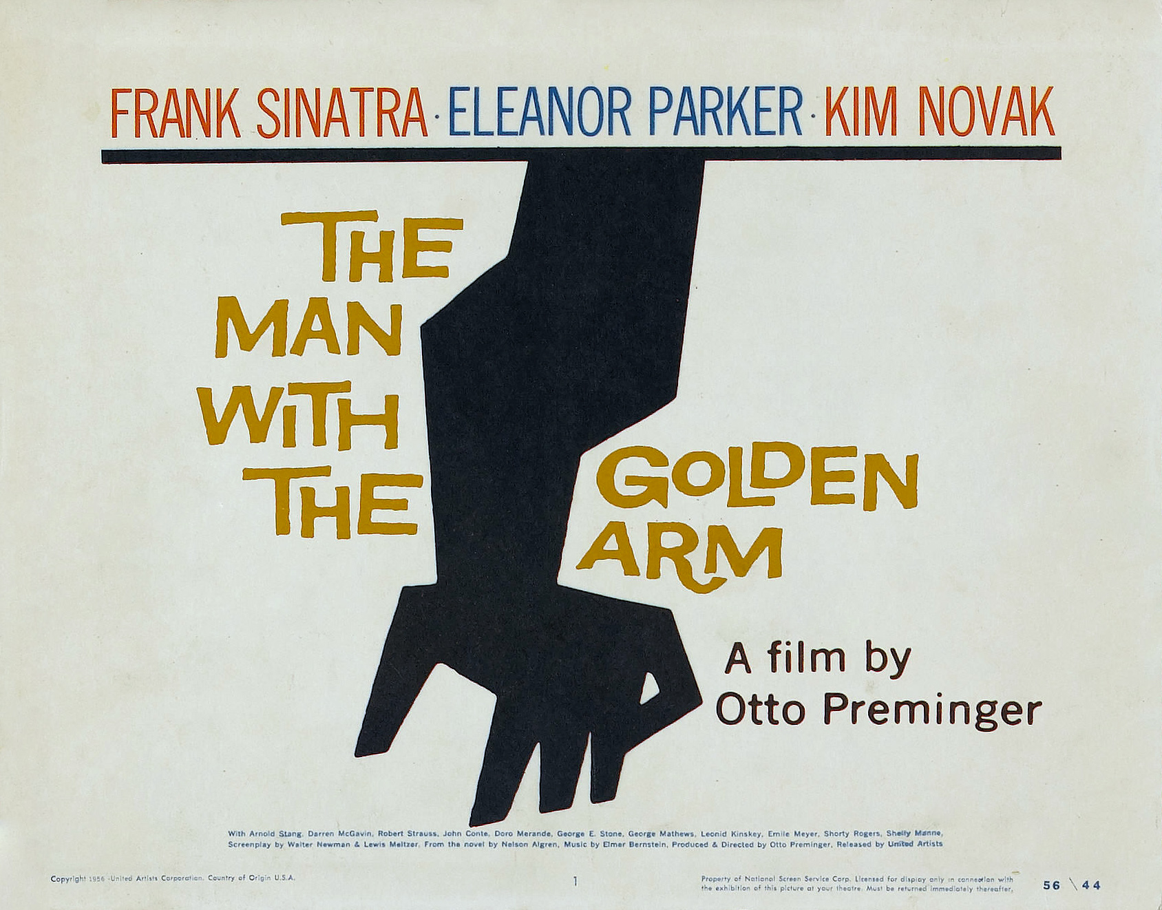 Saul Bass was a graphic designer who became famous for his work in film and classic logo design. Some may argue that he changed the way into attracting audiences to watch films as most American film industries were using techniques like posters or boring paintings. Saul bass' work is commonly known for his geometric shapes and the way he symbolises it. In most of title sequence an image stands out which delivers the most effective message to the audience. He became popular in the film industry after creating his title sequence 'The Man With the Golden Arm' in 1955.
Bass worked with great directors such as Alfred Hitchcock, Stanley Kubrick and Martin Scorsese. With all these experience Saul Bass would go on to make animated opening title sequences. Saul Bass changed the course of opening titles not just by getting information across to the audience through pictures but also giving a short story that intrigued the viewer as well as giving them some sort of information before the film begins. Most of the time it would be a synopsis or reference to the movie itself. He progressed from making these creative images on to making logos of some airlines.
 Kyle Cooper studied interior architecture at the
University of Massachusetts and he then went on to study graphic
design at Yale University. In 1988, he received his Master in Fine Arts. He has
directed and produced over 150 title and VFX sequences. One of those being the
title sequence for Se7en, which could be proclaimed as one of his
most famous pieces of work. Other title sequences he produced was;
The Spider-Man Trilogy, The Walking Dead and American Horror Story.
The great success and positive feedback on the Superman and Spider-Man title
sequences grabbed Marvel's attention and this resulted him directing and
producing the title sequences for other superhero films such as The Incredible
Hulk and Iron Man. Cooper has also had great successes with television such as
producing and directing the title sequences for Sherlock Holmes and Vegas,
Elementary. Typically, his title sequences are very dark coloured, fast
paced, manic and mysterious.
Kyle Cooper studied interior architecture at the
University of Massachusetts and he then went on to study graphic
design at Yale University. In 1988, he received his Master in Fine Arts. He has
directed and produced over 150 title and VFX sequences. One of those being the
title sequence for Se7en, which could be proclaimed as one of his
most famous pieces of work. Other title sequences he produced was;
The Spider-Man Trilogy, The Walking Dead and American Horror Story.
The great success and positive feedback on the Superman and Spider-Man title
sequences grabbed Marvel's attention and this resulted him directing and
producing the title sequences for other superhero films such as The Incredible
Hulk and Iron Man. Cooper has also had great successes with television such as
producing and directing the title sequences for Sherlock Holmes and Vegas,
Elementary. Typically, his title sequences are very dark coloured, fast
paced, manic and mysterious.
Kyle Cooper
 Kyle Cooper studied interior architecture at the
University of Massachusetts and he then went on to study graphic
design at Yale University. In 1988, he received his Master in Fine Arts. He has
directed and produced over 150 title and VFX sequences. One of those being the
title sequence for Se7en, which could be proclaimed as one of his
most famous pieces of work. Other title sequences he produced was;
The Spider-Man Trilogy, The Walking Dead and American Horror Story.
The great success and positive feedback on the Superman and Spider-Man title
sequences grabbed Marvel's attention and this resulted him directing and
producing the title sequences for other superhero films such as The Incredible
Hulk and Iron Man. Cooper has also had great successes with television such as
producing and directing the title sequences for Sherlock Holmes and Vegas,
Elementary. Typically, his title sequences are very dark coloured, fast
paced, manic and mysterious.
Kyle Cooper studied interior architecture at the
University of Massachusetts and he then went on to study graphic
design at Yale University. In 1988, he received his Master in Fine Arts. He has
directed and produced over 150 title and VFX sequences. One of those being the
title sequence for Se7en, which could be proclaimed as one of his
most famous pieces of work. Other title sequences he produced was;
The Spider-Man Trilogy, The Walking Dead and American Horror Story.
The great success and positive feedback on the Superman and Spider-Man title
sequences grabbed Marvel's attention and this resulted him directing and
producing the title sequences for other superhero films such as The Incredible
Hulk and Iron Man. Cooper has also had great successes with television such as
producing and directing the title sequences for Sherlock Holmes and Vegas,
Elementary. Typically, his title sequences are very dark coloured, fast
paced, manic and mysterious.
Subscribe to:
Posts (Atom)